ShopDreamUp AI ArtDreamUp

Deviation Actions


Description
[01/07/13] Edit: Bumped Up some of the detail.
Added a few little additions here and there.
More stars.
More colours.
Tried to make it look a little more deep and fixed some shading and errors.
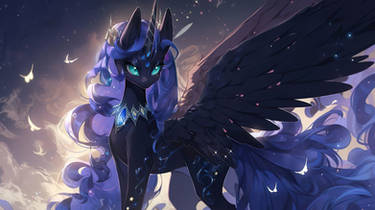
And there at the time where it is neither night nor day she wept under the sight of the weeping moon
Yes I am no writer as you can see.
So I finally finished something new, quite pleased with how it turned out as this was only supposed to be a quick sketch and paint.
I've never done a Luna piece before so I dont know how successful I was but I've spent long enough on this already so my judgment is skewed.
I wanted to try something colourful for once and its not as vibrant and divers as I'd like but I'm still quite happy with the way it turned out.
I don't know exactly how much time it took to paint this but since I'm slow and easily distracted this may have taken anywhere from 5 - 10 hours total.
As I do with all my paintings I have posted a desaturated black and white version.
B&W Version
And just for a little background I have also posted the rough first version of the piece.
Under The Weeping Moon Draft
Remember to hit the download button to see it in full quality!
Thank you, hope you like it!
C-o-m-p-a-s-s
Added a few little additions here and there.
More stars.
More colours.
Tried to make it look a little more deep and fixed some shading and errors.
And there at the time where it is neither night nor day she wept under the sight of the weeping moon
Yes I am no writer as you can see.
So I finally finished something new, quite pleased with how it turned out as this was only supposed to be a quick sketch and paint.
I've never done a Luna piece before so I dont know how successful I was but I've spent long enough on this already so my judgment is skewed.
I wanted to try something colourful for once and its not as vibrant and divers as I'd like but I'm still quite happy with the way it turned out.
I don't know exactly how much time it took to paint this but since I'm slow and easily distracted this may have taken anywhere from 5 - 10 hours total.
As I do with all my paintings I have posted a desaturated black and white version.
B&W Version
And just for a little background I have also posted the rough first version of the piece.
Under The Weeping Moon Draft
Remember to hit the download button to see it in full quality!
Thank you, hope you like it!
C-o-m-p-a-s-s
Image size
4840x3160px 16.98 MB
© 2013 - 2024 Rain-Gear
Comments115
Join the community to add your comment. Already a deviant? Log In
A truly wonderful composition, embodying what I like to call the 'silent beauty' type of art. By that I mean the lone figure experiencing a landscape.
Good use of color, composition, texture effects and big picture stuff. I also like your edge work.
Let me say that this is a good art, however, critiques aren't all happiness and sunshine but rather about striving towards improvement. When looking at the piece initially it's really impressive, however when I look closer things fall apart a bit. Individual elements seem overused, let me explain specifically:
The grass is a little too repetitious, as <img class="avatar" src="a.deviantart.net/avatars/h/u/h…" alt="
 " title="Huussii" /> has told me, the odd long blade here or there really adds to the believability of grass.
There's no scale for the forest. It's all the same size tree that all happen to start equally back. A few larger trees closer to us would help. Again, it's that bit of variety that adds believability.
The hills are all the classic rounded hilltop. While one or two is fine, too many becomes repetitious and less believable.
The mountains have just enough variety to them.
Color wise things are chosen well. A little more 'sharing' would help things belong in the same space. What I mean by sharing is pulling some of the pinks and purples from the sky and using them to highlight and shade the foreground and middleground.
I think it would help with the mountains for you to study landscapes while paying particular attention to volumes and edges. It helps to ask questions like: "Which side of the mountain is lighter?" "Where does one mountain end and the other begin?" "How does the forest transition from being on the ground to the mountain?"
Anatomically I don't quite believe the pony. Things are a little stiff and while this may be the result of working small, you can always work large and shrink things down later.
Space wise, here's a general rule: Things go from dark in the foreground to light in the background for atmospheric perspective. This means if your sky was lighter (like the light purple they use in the show) then it would fall back in space. That being said, dark blues are very pretty and difficult to get away from. As with all things it's about balance.
As with all my DA critiques, 4 stars for everything. Critiques are about improvement, not ratings.